
The candlestick chart is the most popular and sought-after chart when it comes to analyzing the market trend or direction. Since a candlestick chart is used to easily track the price movement, it is widely used by traders. Candlestick pattern shows the direction in which prices are moving or have moved.
Let’s go back to the history of how it all began. In the eighteenth century, a Japanese trader named Munehisa Homma developed this strategy to trade rice. During that period in Japan, rice was a medium of exchange. Munehisa Homma who was a rice trader studied rice trading price behaviour. His methodology and technique evolved into candlestick patterns. Traders use candlestick patterns to derive short-term trading decisions.
A single candle represents x amount of time. Say – 1 minute, 2 minutes and so on. The time frame of a candle can be anything above 1 minute. Traders in general use 5 minute candles whereas investors use daily candles to see the price action as the candle represents demand and supply of prices.
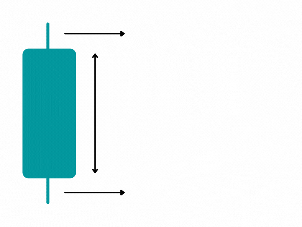
Well, now let’s understand the elements of a candlestick. It has three primary elements;
· The Body of the candle
· The Upper shadow of the candle
· The Lower shadow of the candle
Every candle has an open, close, high, and low. In simpler words, the body represents the opening and closing price. The shadows on the top and bottom are also known as the wicks which show movement above and below the opening price. Easy! Isn’t it? Yes.
Also, the lower shadow represents the lower price and the higher shadow represents a higher price for any candle.
Take a look at the image below to get a clear understanding.
Now let’s go on to understand the two main types of candlesticks.
· The Bullish Candle
· The Bearish Candle
1. The Bullish Candle.
A bullish candle demonstrates that the price has closed high. How can we study a bullish candle? Well!! In a bullish candle, the price usually rises over and above the opening price and the opening price is at the bottom of the candlestick.
And the shadows on either side are the lows and highs for the timeframe. The shadow on the bottom side is the low price and the one at the top indicates the high price. There are a few different types of bullish candles.
You’ll understand better if you look at the image below.

2. The Bearish Candle
A bearish candle on the other hand demonstrates that the price has closed lower. What we infer from this is that the price has fallen below the opening price.
Similar to the bullish candle, the shadows are the lows and highs for any particular time frame. Here’s an image for you to understand better.

Now let’s dive into the most crucial part of understanding the candlestick pattern which is the length of the shadow. Look at the chart below.
Why is it lengthier at certain places and less in certain spots? It is caused because of the price action between buyers and sellers.

In the above chart – even though both of them are bullish candles, you could see a clear demarcation in price rejection between the two candles. In the first candle, since the buyers were strong, price rejection was weak. Whereas in the second candle price got strongly rejected from higher levels because of weak buyers.
A similar instance can happen to a bearish candlestick as well. But instead of buyers, sellers play a major role in price fluctuations.
The above-mentioned points are as easy as ABC. Weren’t they? After all, they aren’t rocket science. What I have explained are the basic concepts.
But anyway, If you would like to learn more through one on one personal coaching and mentoring, then click here to know more.